05 · Editorial Design · Visual Identity · Undergraduate
University Projects
Projects developed during my Design degree at the University of Caxias do Sul, in collaboration with fellow students, exploring branding, editorial design, visual communication and graphic systems applied to both real-world and conceptual challenges.
- Institution
- University of Caxias do Sul
- Timeline
- 2022 — 2026
- Format
- Team projects
- Courses
- Editorial Design · Visual Identity
Case Study 01 · 2024
39th Bento Gonçalves Book Fair
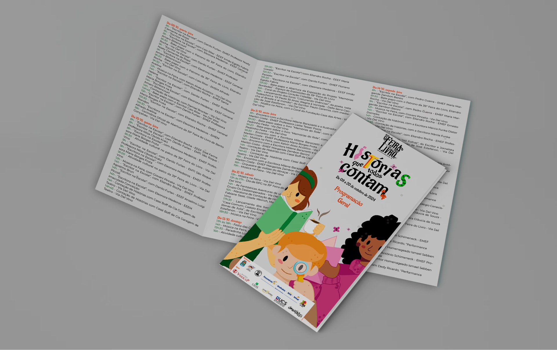
Visual identity and communication materials for the 2024 edition of the fair, themed "Stories everyone tells".
Overview
A collaborative project with fellow Design students at the University of Caxias do Sul to create the visual identity for the 39th Bento Gonçalves Book Fair.
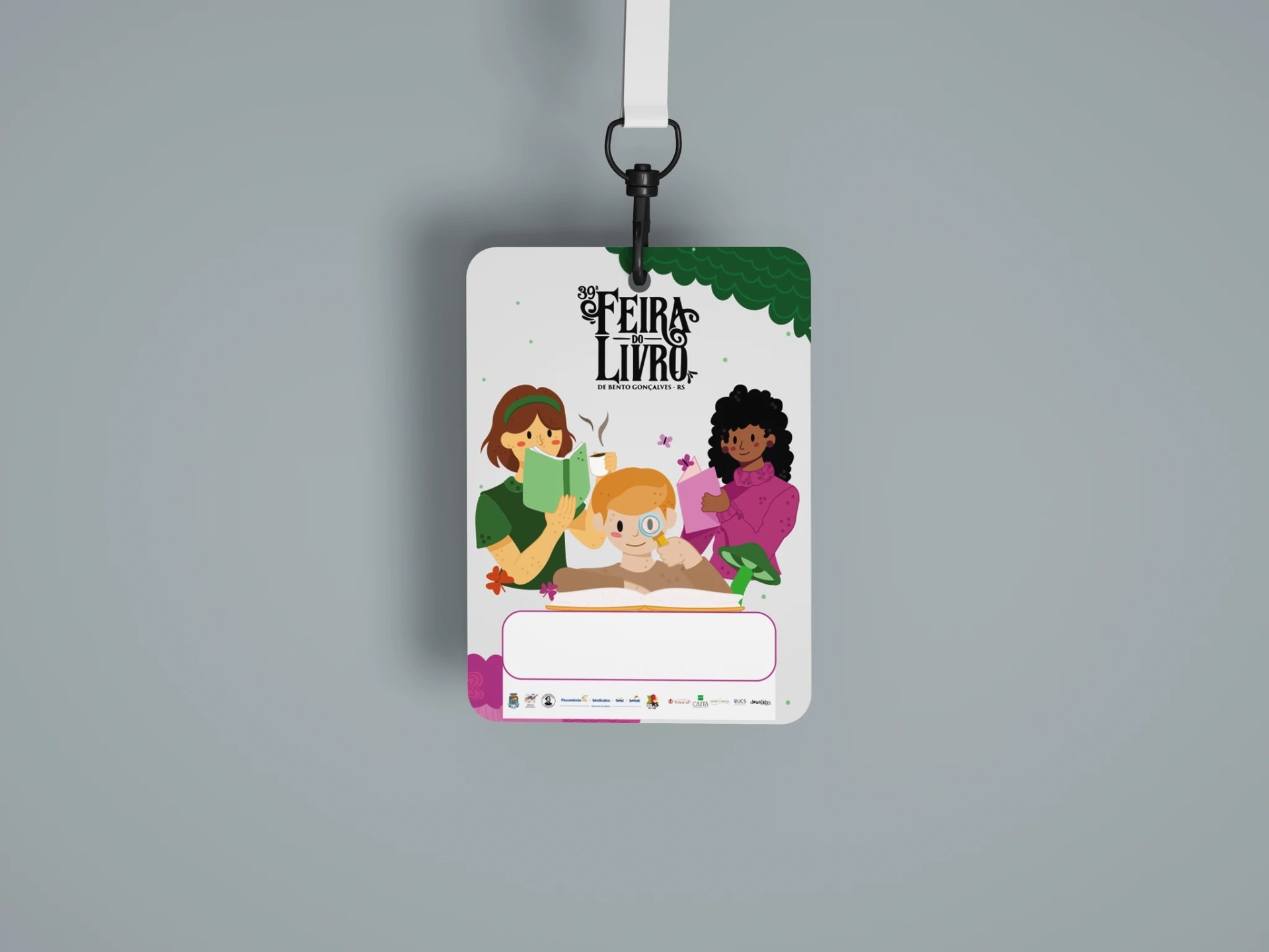
I contributed to the graphic identity and the development of printed and communication materials used throughout the event, including the program folder, badges, posters and signage.
The visual language was built around the idea of reading as an encounter, using children's illustrations, a lively color palette and handwritten-style typography to connect the event with school and family audiences.
Case Study 02 · 2024
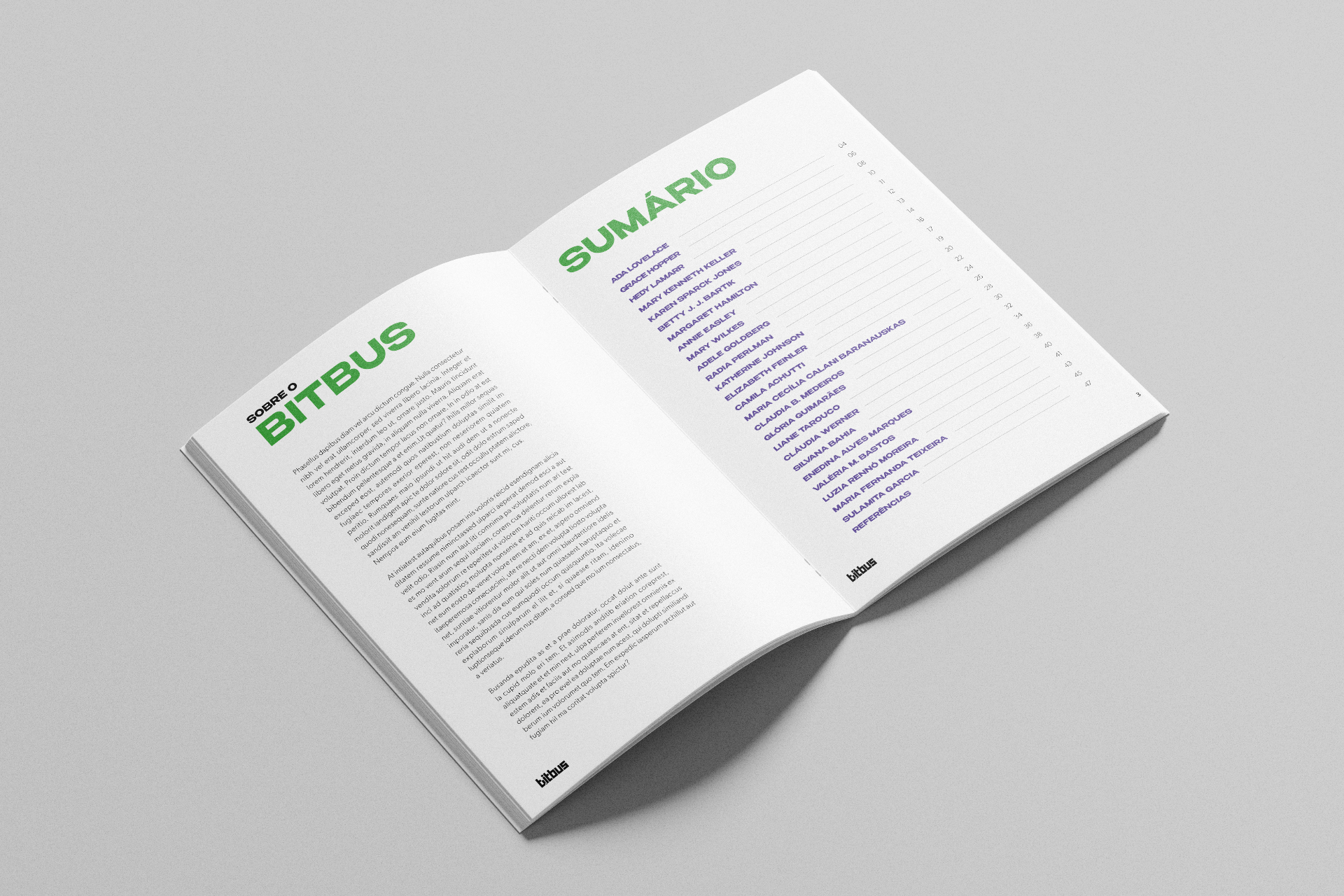
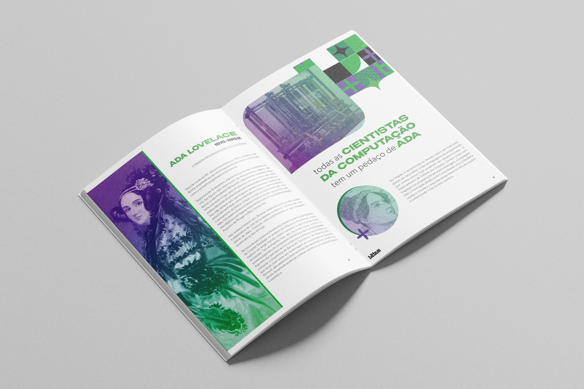
BitBus • Women in Science
An editorial publication dedicated to celebrating women's contributions to computing and science.
Overview
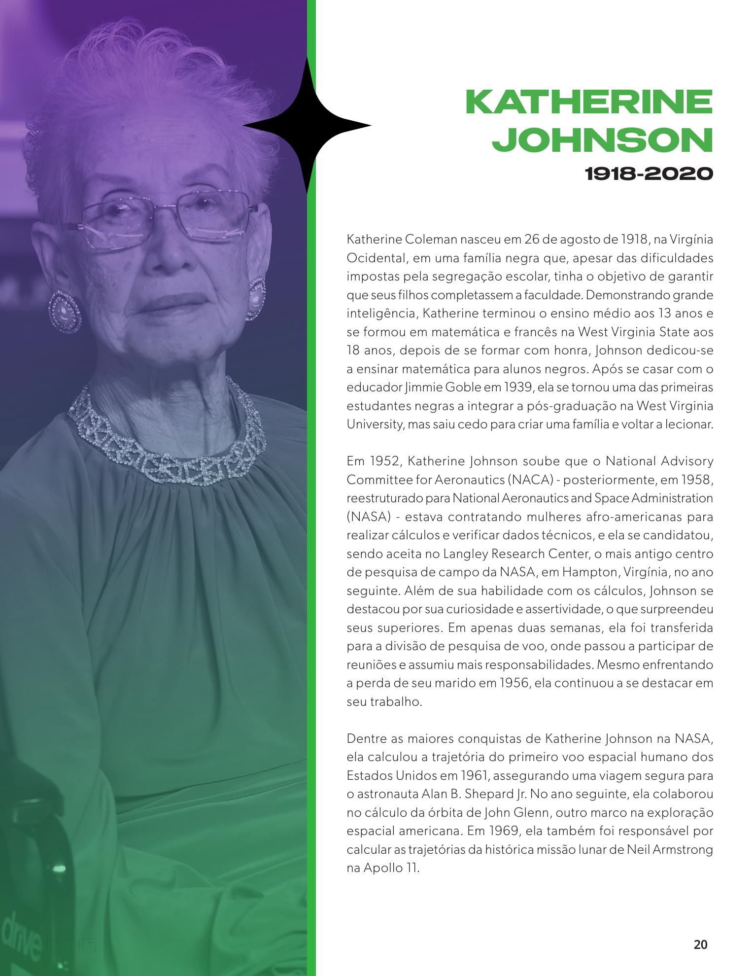
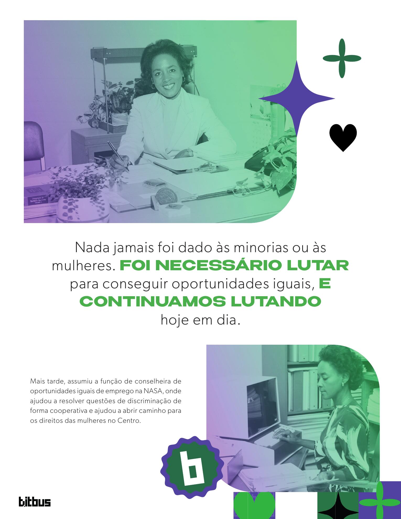
An editorial project developed as a team during my undergraduate studies, focused on celebrating women's contributions to computing and science.
The challenge was to structure a publication capable of communicating historical content in an accessible way, using visual hierarchy, typography, illustration and editorial composition.
The graphic system combines a palette of green, purple and black over a neutral background, modular geometric shapes, and duotone photo treatment, creating a cohesive visual narrative across the biographies.